Being far to lazy to go through the process of doing the math and preparing the information in a way that's easily understand I sort of forgot about it, until June of 2017 when I happened to notice Dave's article for the first time. Here are some notes about the math.
I want to preface this by pointing out Dave didn't misstate anything - it's not that there's errors that compel me to write this, it's just that the numbers can be explained a little better, I had a hard time understanding Dave's graphs and I'm used to the data
It's also worth mentioning that the math here isn't only for "pollutants" per se, it's actually applicable to any compounds dissolved in water so you could use it to calculate pollutants such as fish waste but this math also holds true for plant fertilizers added to a tank and as you can see from the charts these ideas are as important in trying to maintain a level of certain compounds in the water as they are in trying to keep other compounds out.
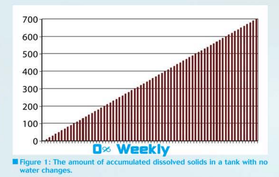
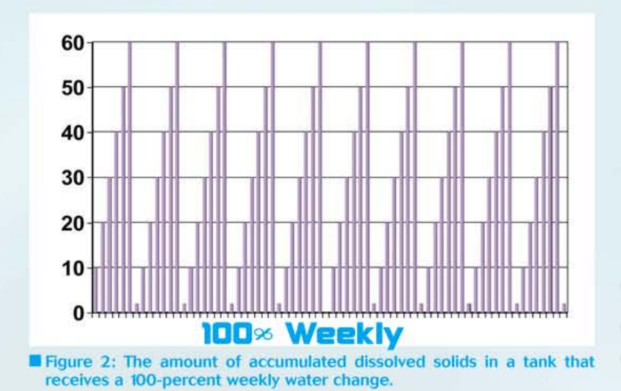
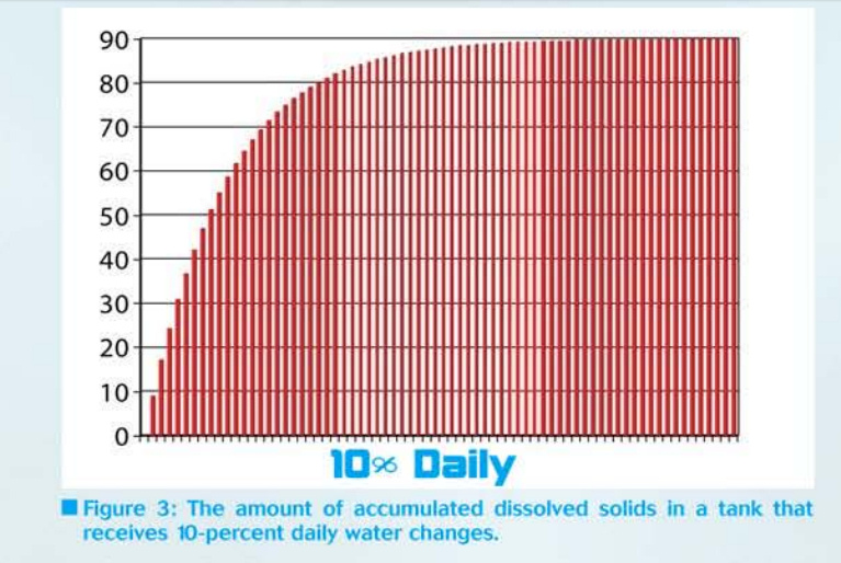
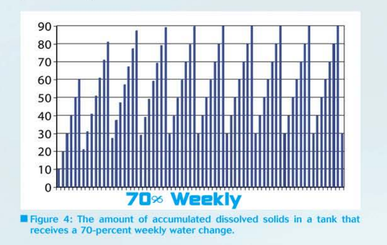
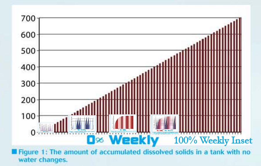
Ok, on with the math. First, have a look at Dave's charts, here they are:
There's nothing wrong with these graphs each one is perfectly correct.
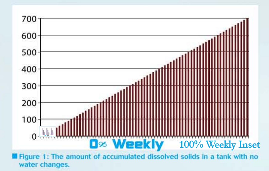
The problem with them is they don't show the data with normalized axes, that is each graph is drawn with a Y axis that makes sense for that particular graph ad the range of data in the Y axis (the x-axis is fixed) and there are three ranges here, 0-60, 0-90, 0-700, all on graphs the same size physically so right way you can see the problem the range of the smallest group of numbers is one tenth of the largest one and they'd look pretty different on the same chart even though they may look the same the way they are now.
For example the "0% water changes" graph goes from zero to seven hundred but the "100% weekly" graph only goes from zero to sixty and when you put one, inset, into the other it's just a tiny spec in the lower left corner of the graph, pictured above. It's all you can do, you can't put the 0-700 graph on the small one - if you try you get a line going straight up and it's not helpful.
But it shows the point I want to make: in the graphical display of quantitative information the data has to all fit on one graph so you know how it all relates to each other.
Failure to do that could give you a misleading impression - after awhile it becomes instinctive to look at the axes first and then and only then the data otherwise you have no idea what you're looking at other than an arbitrary line of some unknown scale.
They are more important than the data itself; if the axes increments are very small a steeply rising graph might look terrifying but when you normalize the axes and show all the data together then and only then can you get your data into the kind of climate where people actually understand the mechanics of what's happening instead of coming to perhaps an incomplete conclusion based on literally a distorted view of the numbers.
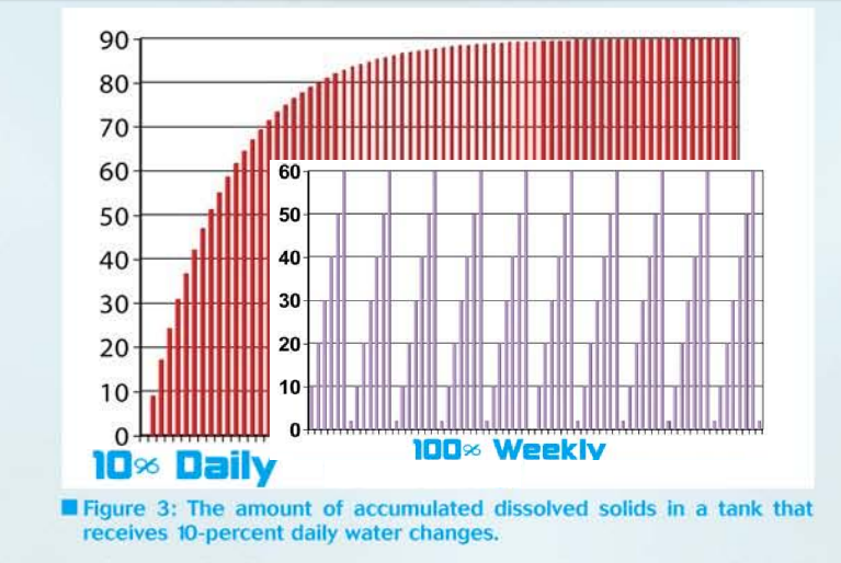
This is what it looks like when we superimpose both graphs after shrinking one so that it's 0-60 scale is the same size as the other graphs 0-60 range so both graphs show information with the same scale. Look at the difference.
Picture if you will that inset graph going all the way across the screen to the other side, that's what it looks like with those kind of water changes, the background huge curve is even more huge than you'd perhaps think from looking a the raw graphs.
I think this more forcefully drives home the point that water changes really do help and not doing them results in literally no limit to what can build up. Taken to the extreme and over many many years and assuming it was always topped up with tap water then it would eventually turn to stone. Or you could change the water, your call.
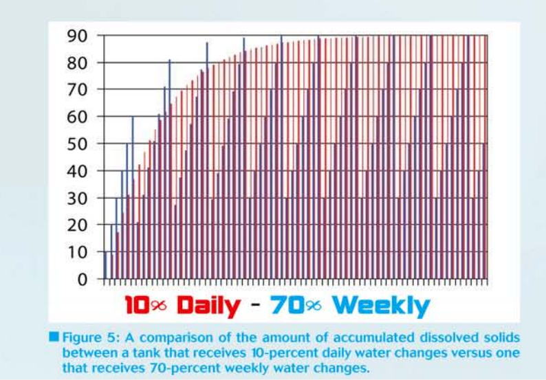
Now look at this:
Compared to the 0% graph, the 10% Daily and 70% Weekly graphs are easier to read as they are bigger, nearly twice as big. They don't go from 0-60, they go from 0-90 this they need to be shrunk less to make the scales fit.
Here you can see that all things being equal, one 100% water change does more good than either 10% daily or 70% weekly. By a large margin.
So that's what the chemicals in the water look like when you change water 100% at a time once a week - you have less "stuff" in the water than by hanging small amounts daily or even a large but not total water change once a week - and it's not just a bit cleaner, the water has nearly half the pollutants.
If the water were changed 100% twice a week then the height of small inset graph in that image would be halved in height, repeat this to the end case of changing 100% of the water daily and you really can't get much cleaner water than this. Ok unless you change 100% of the water twice a day and even then switching to a continuous flow system with fresh water constantly being infused still beats it.
That being said, a 100% water change once a week is not that much more work than a 70% water change and does twice the good for 30% more effort and is therefore worth doing. It's certainly less work than 10% daily which you might think wold be better, but it's 30% worse actually - look at this comparison of 100% Weekly compared to 10% Daily. Now of course if you're doing this for exercise or to infuse CO2 from tap-water (it's loaded with the stuff) then you can still change 10% daily, just change 100% weekly, this beats doing both and it should not be difficult to imagine what that graph looks like.
Change 100% of the water? Who does that?
From TFA:
Who does that? People that farm discus, that's who. People that have bred altums, that's who. People who don't have any Tropheus die on them ever, that's who.
I thought I was the only weirdo who did this and I would on two occasions: first, I figured out at a young age that feeding worms and changing ALL OF THE WATER even more than once a day caused killifish to ignore the books that say "3-7 eggs a day are deposited in fine leaved plants" and would instead incent them to mate like rabid mink and deposit 60-150 eggs in an hour for gardneri, 80-120 for australe and 3-500 for gularis. Fertilization rate were the same as collecting a few eggs daily. As a side note this didn't work once with an Epiplatys I tried it with but it did work well for cameronense.
The point is it helped and the examples I gave above are from people I've known doing exactly these things, 2 in real life and the discus example is given here in a fairly compelling video. (below) So the argument "my discus are too sensitive for anything like this" can be met with "not if the temperature matches, they're used to it don't worry" and the odd thing is even as these discus are on flat on their sides they're not particularly bothered. I can change 10% of the water in a goldfish tank and they'll go spastic, so the argument is I think, invalid.
I hope this gives a broader understanding of the math behind this rather central issue.
N.B. - Dave did this with a spreadsheet. Here's the formulas he used in case you want to play with this stuff yourself.
(BTW, that's "LD50" not "LC50". (viz #11 in this chart)
